Listening to End-user Input & Understanding Lab Workflow to Enhance System Usability
Particularly in healthcare, it is important to design information systems that are user-friendly and that enhance, rather than interrupt, workflow. While competitors have low usability scores for both EHRs and laboratory information systems (LISs), Orchard Software engages in actively listening to customers and “learning the lab,” which is why Orchard® Harvest™ stands out among competitors in a peer-reviewed, non-biased usability study. Harvest’s high level of usability improves workflow for laboratory professionals, supporting the lab’s vital contribution to patient care.
Have you ever worked with software or other technology that seems to already know your next move and sets you up for smooth sailing? And, conversely, have you used a frustrating software tool where you had to guess and click every little dot or hamburger menu to try and find the function you need? Both scenarios exist. The challenge is to design systems that are user-friendly and intuitive to use, particularly within complex healthcare
workflows.
Within our healthcare system, the adoption of health information systems and other technology continues to steadily grow. However, many of the health related information systems are seen as intrusive to workflows and patient care, especially the EHR. Designing interactive health information technology is becoming crucial in an industry trying to find a balance between the tasks that humans handle best for patient care and the tasks that technology handles best. By listening to end users’ needs and concerns and gaining a full understanding of specific workflows, better system usability can be achieved.
Human-computer Interaction
The way humans think and process steps logically influences how they interact with computers and other technologies. Human-computer interaction (HCI) is a field of study dedicated to understanding how technology design influences human interaction. How specifically can technology be designed so that it is easy to
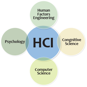
use and the next steps are intuitive? The study of HCI combines many fields, such as computer science, cognitive science, and human factors engineering (see Figure 1).1
HCI research has focused on trying to design and develop technologies that fit into the everyday routines of the end users, which is referred to as user-centered design. In user-centered design, end-user needs are considered throughout the entire design and development process.
From a healthcare perspective, a user-centered design approach would focus on the usability, usefulness, and fit of a technology into daily workflows for each type of healthcare worker who uses the system. However, this user-centered approach has not been the norm in healthcare; rather, design has centered on technical capabilities, which is important but does not make a system fit easily into a patient-care workflow and can be frustrating to healthcare workers who are trying to see patients at a steady pace.
Information System Usability
The International Organization for Standardization (ISO) defines usability as “the extent to which a product can be used by specified users to achieve specified goals with effectiveness, efficiency, and satisfaction in a specified context of use.”2 Designing technology with high levels of usability adds a layer of design to the development phase that is sometimes overlooked in order to speed a technology into production. Development of new technologies outpaces the rate at which we actually understand how people will use the new technology.
In addition, humans have physical and cognitive limitations that change as we age. Younger people who have grown up surrounded by different types of technology may be less tolerant of legacy systems that are cumbersome. Older users may struggle with less obvious user-interface prompts. The key is to develop complex applications that work for the majority of users because how users need to use the system is clearly understood during system design and development.

Usability includes five quality components: learnability, efficiency, memorability, errors, and satisfaction (see Figure 2).
- Learnability – How easy is the system to use when first encountered?
- Efficiency – How quickly can tasks be performed?
- Memorability – How easily can users remember how to use the system?
- Errors – How frequently are errors made? How serious are the errors? How difficult is it to correct errors?
- Satisfaction – How pleasant is it to use the system?
A newer term that defines usability is “user experience,” which also encompasses system aesthetics and alignment with values.3
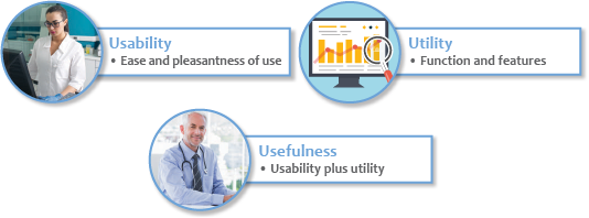
In addition to usability or user experience, the system or technology must provide the necessary functionality desired, which is described as utility. Utility combined with usability equates to overall system usefulness (see Figure 3). To maximize system usefulness, it is imperative that end-user input is considered during information system design, as these are the people who know what the system needs to do to make their jobs easier. Another common mistake is to try to fit an information system into a current paper workflow when, in fact, the point of the system is to streamline processes and create a newer, better workflow based on the work that needs to be done and the system functionality.
It may seem, when looking at usability, that there must always be a trade-off between an easy-to-learn system and a system with the required complexity of features. However, this trade-off can be mitigated with the use of “accelerators,” which are interface aspects that allow the user to complete frequently performed tasks more quickly. Examples of accelerators include function keys, pop-up menus, command name abbreviations, and double-clicking—all considerations in user-centered design.3 The end goal is a technology that is highly functional, flexible, intuitive, and satisfying for the end users.
Usability in Healthcare Technology
The complexity and diversity of workflows within healthcare organizations adds a level of challenge to designing IT so that it is flexible enough to fit into the varying patient-care scenarios while still maintaining patient safety and information security. Although much slower to adopt IT systems, with many only doing so with the EHR incentive program’s encouragement, the healthcare market is now on board with health information technology (HIT) adoption and is rapidly implementing EHRs and many other IT systems and devices. However, much of the current HIT includes poor usability, and systems are known to slow, rather than enhance, the process of patient care. Because development and adoption have been so rapid, and with a certain level of unwillingness, systems were created with minimal user input. As a result, poor usability has become a central issue across healthcare.4
When end users find a system to be complicated and inefficient, they develop alternate ways to accomplish a task, rather than use the cumbersome system. Poor usability is known to result in errors and cause workarounds that have the potential to compromise patient safety and negatively impact patient care.5
User satisfaction, defined as “the potential of system impact and overall user experience,” impacts the successful use of a system as well as overall healthcare organization performance and patient outcomes.6 However, it becomes necessary to align the HIT system with the workflow needs, and this can be the challenge.
EHR Usability
Specific to the EHR, usability has caused complaints since the beginning of its adoption. As a result, the Agency for Healthcare Research and Quality (AHRQ) has looked into EHR usability to define the specific deficiencies. In response, the National Institute of Standards and Technology (NIST) health IT usability initiative was developed to establish a framework to assess HIT usability. AHRQ, NIST, and the Office of the National Coordinator for Health Information Technology (ONC) are working together to measure EHR usability in order to make improvements.
Poorly designed EHR user interfaces are one of the leading causes of medical errors.7 Improving HCI can affect physician adoption of the EHR, as well as improve patient treatment tracking, quality measures, and data analysis.
LIS Usability
 The LIS has been around significantly longer than the EHR, allowing vendors that listen to their customers the time to develop feature-rich, mature products. In today’s laboratories, an LIS is a necessity to streamline workflows, reduce errors, and speed delivery of results so that the clinicians’ decision-making process results in improvements in treatment plans and diagnostic outcomes.
In a 2017 survey, 82.4% of participants felt that using an LIS improves the level of service the laboratory provides, and 81.6% indicated that the LIS improves laboratory workflow and management.8 Nearly 84% agreed that LIS use improves test accuracy and speed of reporting, with a net positive overall perspective regarding LIS usage.8 Those who believed the LIS to be high in usability and usefulness were more highly motivated to use the system.8
Even so, according to a 2017 Journal of Pathology Informatics paper, authors Mathews and Marc report that while LIS usability is much less discussed than EHR usability, its usability scores are also relatively poor when compared to System Usability Scale (SUS) scores. The authors conclude that LIS usability is not any better than EHR usability.9
Comparing LIS Usability
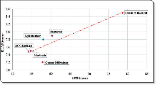
The aforementioned LIS usability study used a survey consisting of the 10-item SUS, distributed among LIS users at hospitals across the United States. In addition, participants were asked to rate the ease of performing 24 common LIS tasks and add any specific comments about LIS likes and dislikes. The results of this study indicate that overall usability of LISs is poor. The mean SUS score for each LIS was compared to a benchmark mean SUS score of 68, which was derived from previous research. The overall mean SUS score for all LISs evaluated was 59.7. To validate the observed scores, the average SUS score for each LIS was compared against the KLAS ease-of-use scores, resulting in a significant strong positive association between the SUS and KLAS scores (see Figure 4).
The top three tasks ranked “very difficult:”
- Running ad hoc management reports
- Copying results to additional recipients
- Creating quality control reports9
Creating reports, system slowness, printing, and “too many clicks/keystrokes/steps to perform tasks” were common “dislikes” among LIS users.9
The top three tasks ranked “easy:”
- Receiving a specimen
- Identifying abnormal results
- Cancelling a test9
Harvest Stands Out
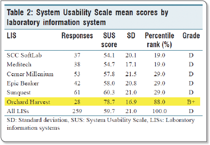
The benchmark score was derived from previous usability studies, so for this evaluation, scores above 68 were considered above average. All of Orchard’s years spent actively listening to its customers and making product changes has paid off, because Harvest stood out significantly in this non-biased, non-sponsored scientific study, with an overall score of 78.7, which is well above the benchmark (see Figure 5). Interestingly, when the researchers looked at years of experience to try and address the disparity, it did not explain why Harvest stood out so far ahead of its competition.9
The Clear Winner is Harvest
Harvest’s mean SUS score was significantly greater than those of Cerner Millennium, Epic Beaker, MEDITECH, SCC SoftLab, and Sunquest. Raw scores were converted into percentile ranks and assigned a letter grade, with Harvest scoring a B+ compared to “failing” Ds across the board for other LIS products (see Figure 5).9
Listening to Our Customers
 Harvest is such a strong LIS because of the partnership Orchard has with its clients. By listening to customer requests and “learning the lab,” Orchard has been able to make a product that lab users intuitively and effectively use to make their jobs easier and increase the laboratory’s contribution to patient care.
As we all know, when systems are cumbersome to use, “workarounds” are created to circumvent the system but can lead to safety issues or missing data. At Orchard, we consider our customers as partners, and we appreciate the ongoing support and input that has made Harvest such a valuable tool for laboratories of all shapes and sizes.
References
- Carroll, J. M. (n.d.). The encyclopedia of human-computer interaction, 2nd ed. Interaction Design Foundation. Retrieved from https://www.interaction-design.org/literature/book/the-encyclopedia-of-human-computerinteraction-2nd-ed/human-computer-interaction-brief-intro
- International Organization for Standardization (ISO). (1998). ISO 9241-11: Guidance on usability. Retrieved from https://www.sis.se/api/document/preview/611299/
- Nielsen, J. (2010). What is usability? In Defining Usability. (pp. 3-22). Retrieved from http://booksite.elsevier.com/samplechapters/9780123751140/02~Chapter_1.pdf
- Staggers, N. & Makar, E. (2017). National efforts in 2016 to improve health IT usability. Online Journal of Nursing Informatics, 21(1). Retrieved from http://www.himss.org/ojni
- Bowman S. (2013). Impact of electronic health record systems on information integrity: Quality and safety implications. Perspectives in Health Information Management. 2013(10,1c). Retrieved from https://www.ncbi.nlm.nih.gov/pmc/articles/PMC3797550/
- Yusof, M. M. & Arifin, A. (2016). Towards an evaluation framework for laboratory information systems. Journal of Infection and Public Health, 9(6), 766-773. https://doi.org/10.1016/j.jiph.2016.08.014
- Bologvaa, E. V., Prokushevaa, D. I., Krikunova, A. V., Zvartaub, N.E., & Kovalchuka, S. V. (2016). Human-computer interaction in electronic medical records: From the perspectives of physicians and data scientists. Procedia Computer Science, 100, 915-920. https://doi.org/10.1016/j.procs.2016.09.248
- Aldosari, B., Gadi, H. A., Alanazi, A., & Househ, M. (2017). Surveying the influence of laboratory information system: An end-user perspective. Informatics in Medicine Unlocked, 9, 200-209. https://doi.org/10.1016/j.imu.2017.09.002
- Mathews, A., & Marc, D. (2017). Usability evaluation of laboratory information systems. Journal of Pathology Informatics, 2017(8), 40. http://doi.org/10.4103/jpi.jpi_24_17

